EFFY
Not What It Seems
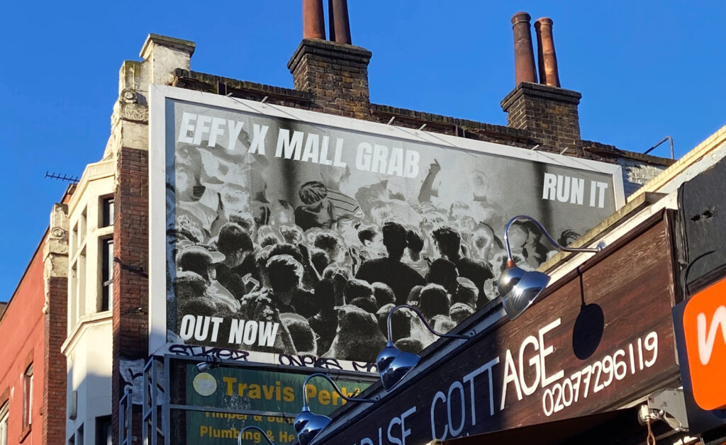
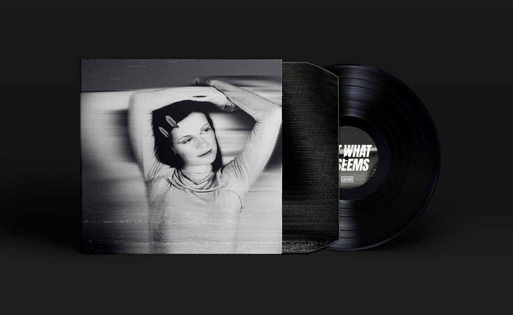
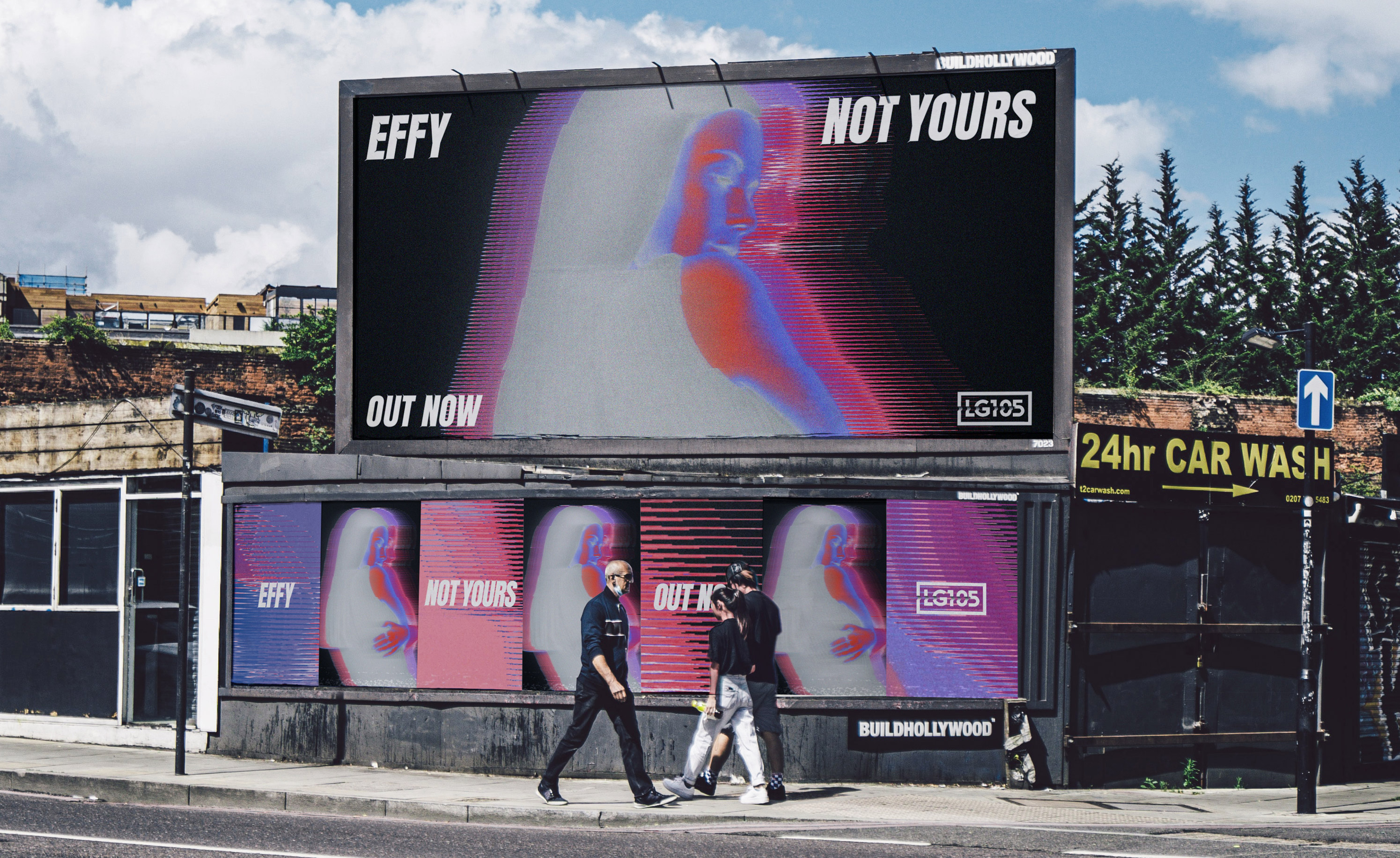
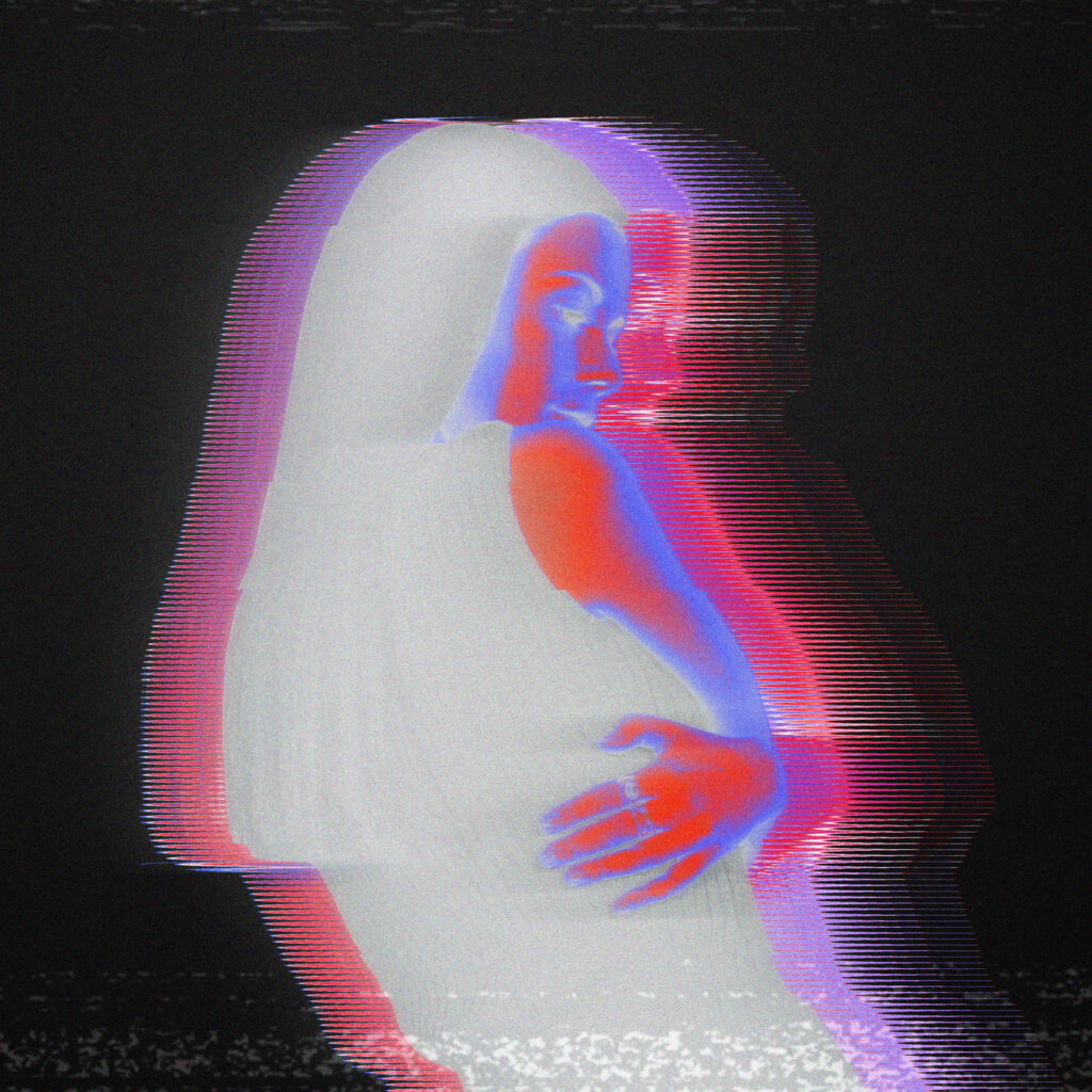
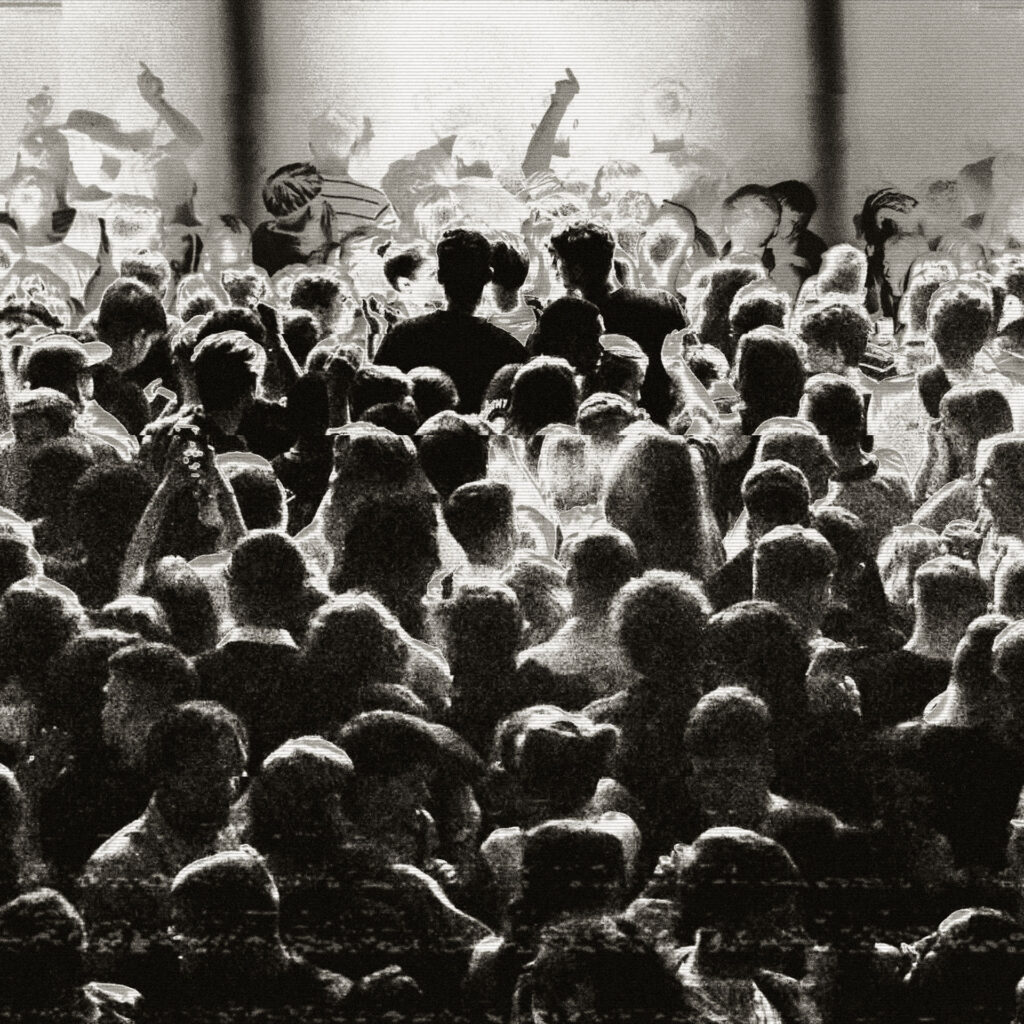
Creative direction, design, and motion graphics for Effy’s ‘Not What It Seems’ EP campaign. Inspired by the diverse perspectives of a club night, the campaign emphasises the connection between the DJ and the crowd, using dynamic light motion to bring the scenes to life.
PROJECT DETAIL
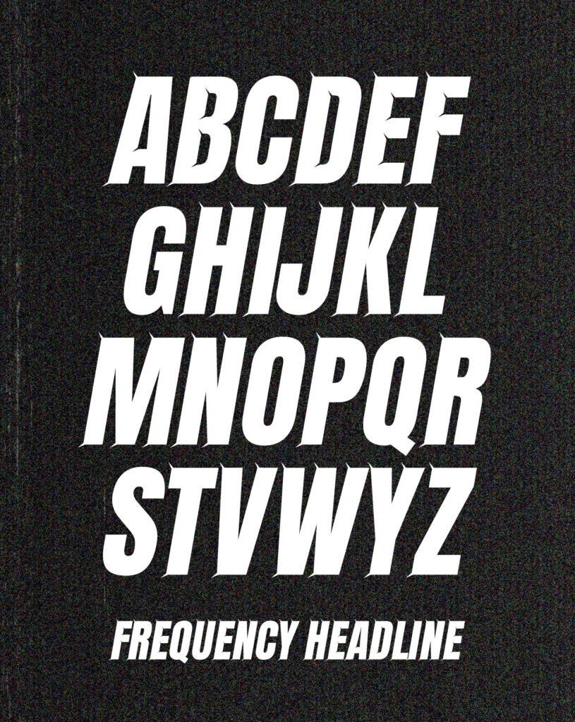
Frequency Headline
As part of the design system we developed and built ‘Frequency Headline’ a custom headline typeface to be used as part of the EP campaign. The italic condensed characters featured spikes that burst out of the letterforms to reflect the impact of sound within a nightclub environment.
The bold typography worked to contrast the rough textures and grittiness of the background elements in both motion and print.
