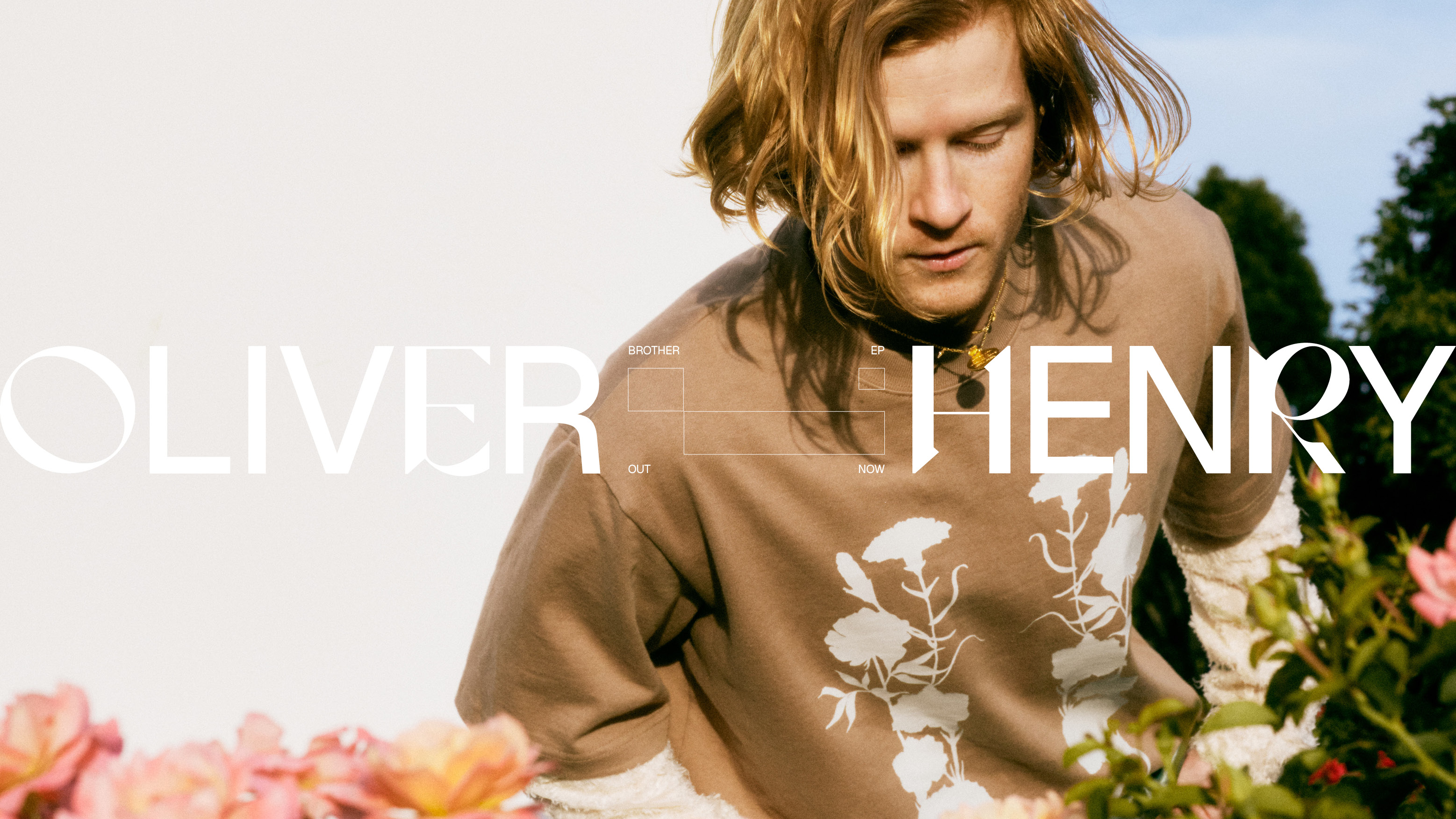
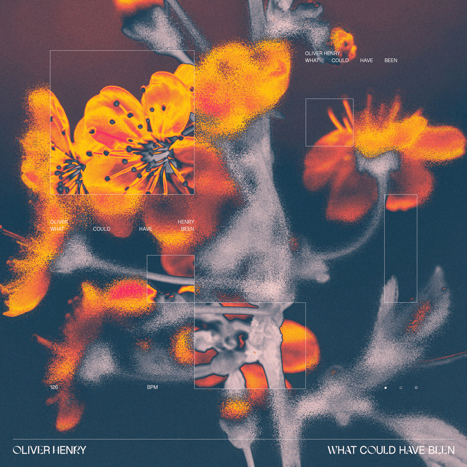
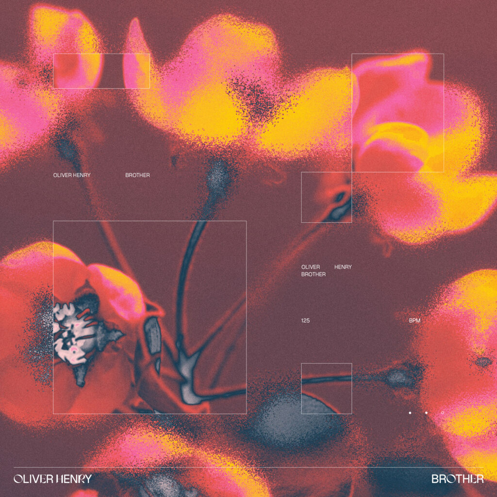
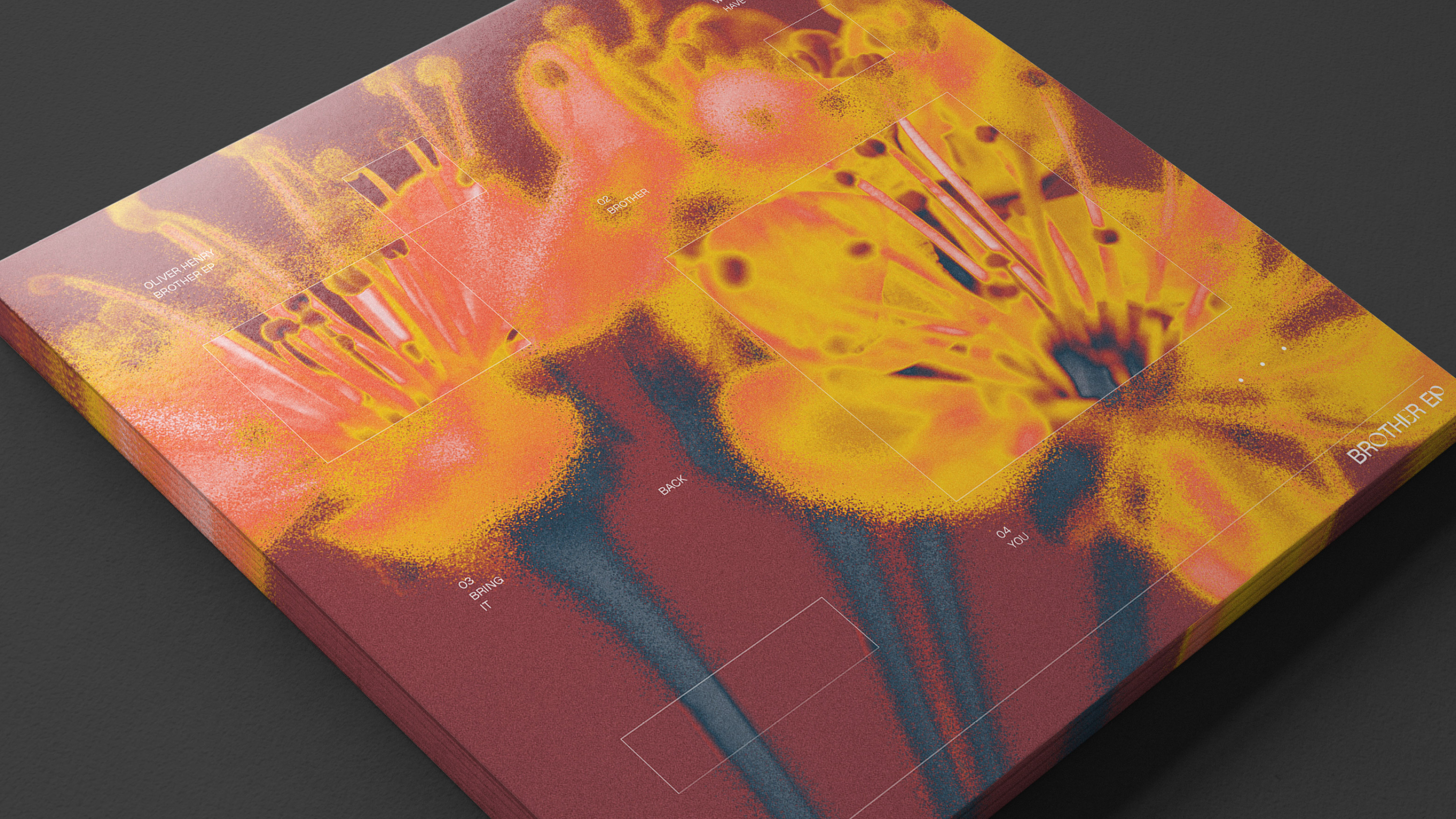
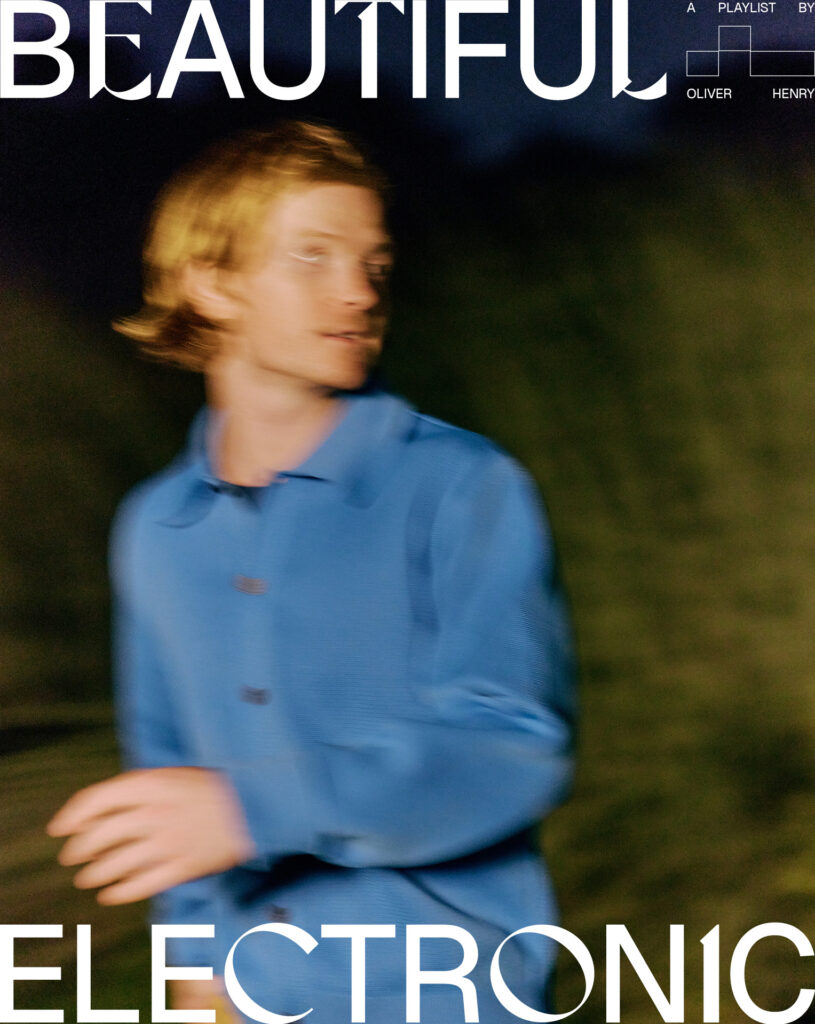
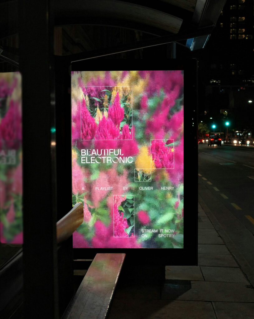
OVERVIEW

OLIVER HENRY

A growth inspired design system for Oliver Henry

We were recently commissioned by Sydney based producer, multi-instrumentalist & DJ, Oliver Henry to create the visual identity and release campaign for his ‘Brother’ EP and associated singles.
The creative concept was all built around growth, balance and layers – themes that underpinned the track titles on the EP and the sounds heard throughout each track. Soft, blurred images of blooming flower buds serve as the focal point of the composition, symbolising the natural growth needed to navigate past experiences, with the multi-layered composition made up of masked images of the flower buds overlapping and interacting with each other. Building on these core principles through motion design we also developed a series of animated visualisers as well as a set of playlist assets used to promote Oliver’s ‘Beautiful Electronic’ playlist.
Deliverables: Creative Direction, Visual Identity, Campaign Creative, Social Media Creative, Animated Visualisers